So this past week, a most interesting and challenging project landed on my desk. I was asked to take one empty and somewhat snoozy office common area (evidence below) and make it look like a space worthy of Google (or Facebook, or Apple, or insert-any-tech-giant-name-here). In other words, it had to be funky, playful, youthful, chill, cool, hipster and, of course, on-budget. The floor and walls were here to stay. Oh, and I had to design, purchase, assemble and decorate the whole thing... IN THREE DAYS.
So this is where we started... a rather busy floor, somewhat eccentric and electrifying wall colors (thanks to the company's logo) and about a thousand white wooden sticks. The company also didn't have any idea what to use this space for...
So we started with the function. After some conversations back and forth to understand the company's needs and culture, we decided to split the space into three areas: two work areas and one lounge area.
The intent was to show off their laid back style but still communicate how much hard work happens in between those walls.
The next challenge was to minimize how busy the floor and bright walls were (the givens) and pick furniture pieces that complemented and worked with these constraints rather than fight them. Below are the design plans I shared with the client:
LOUNGE area
WORK area
Miraculously, they loved everything! I believe that is not something a lot of designers get to hear. I think I just got lucky to work with some awesome people (who, for some reason trusted me :) and we really didn't have much time for disagreement. We technically didn't have much time for anything.
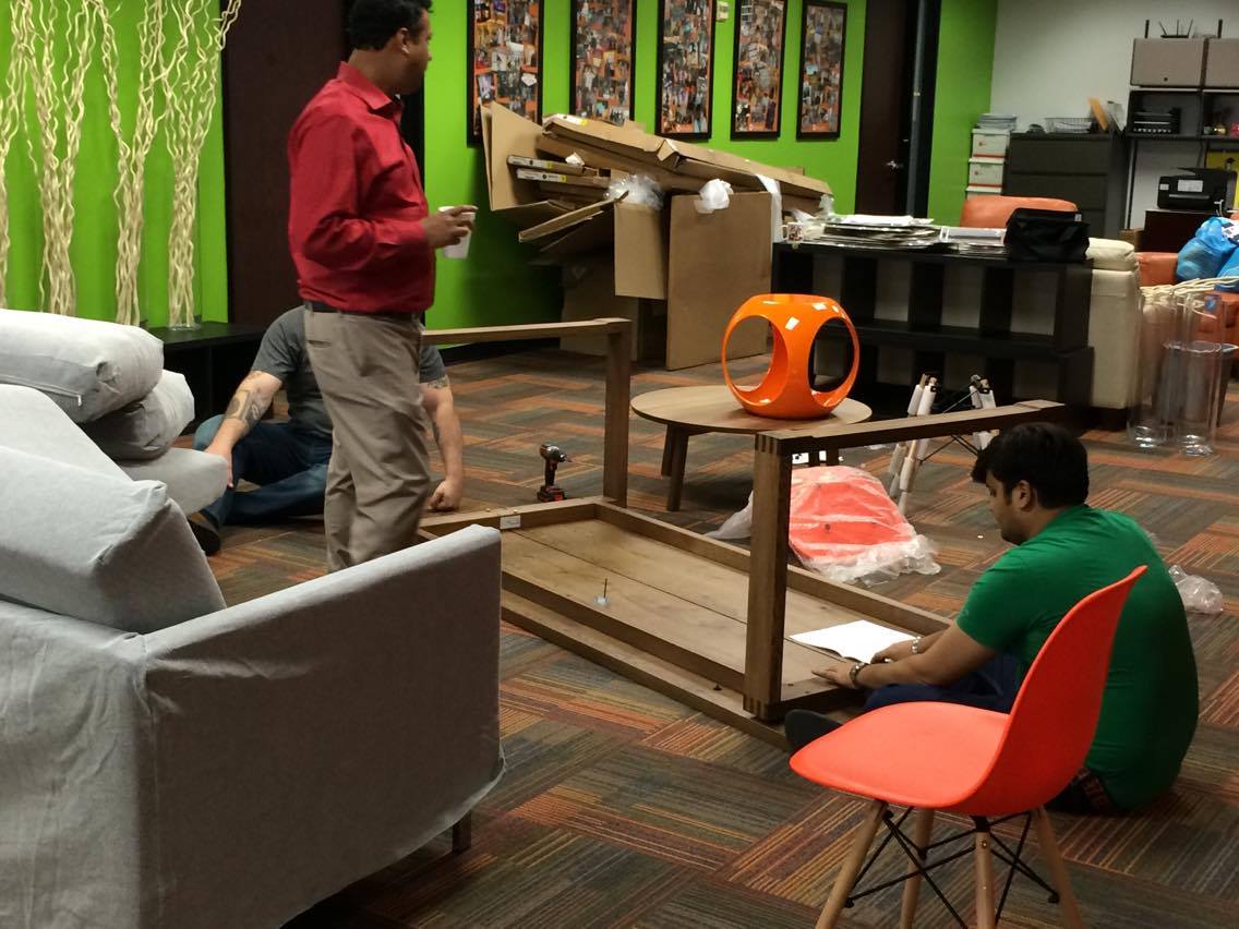
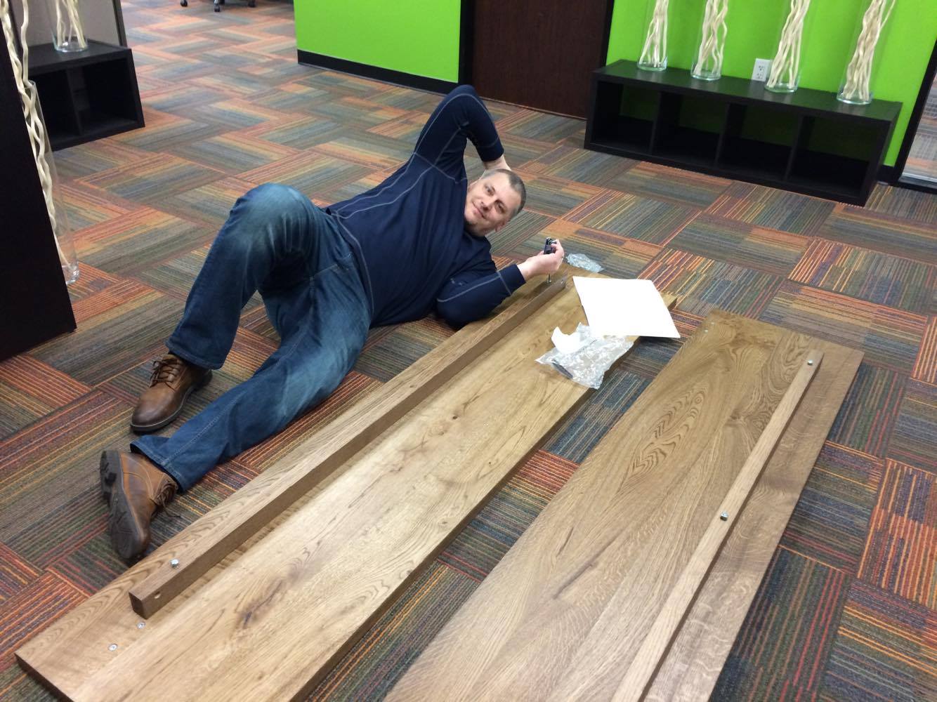
Besides, I think they secretly had a ton of fun doing this...
And here is the final result!
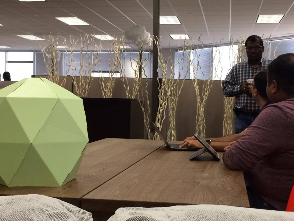
See those awesome lanterns? These beauties were by far the biggest hit of the design. They made a powerful statement while providing much-needed volume to balance all the bottom-heavy furniture. They are also coincidentally the perfect color scheme.
I only had to make sure I had an idea of what I wanted the composition to look like before I purchase them. So I quickly mocked something up (always a good idea):
And I might add that even though I mocked things up, I still did things differently, ha. But a sketch like this gave me a starting point and something to show the client re: what I have in mind.
A few other things worth mentioning... sourcing everything for this project had certain limitations to it in order to make this incredible deadline. Namely, everything either had to be Amazon Prime, IKEA, or shippable overnight. So, that was fun! :)
Secondly, the amazing chalk wall that you see? That was already there, looking glorious in its gigantic scale. I felt it was my job to show it off even more.
Lastly, this is a tech company. Hedgehog pillows wouldn't fly anywhere. But this client had plenty of charm and playfulness to be able to pull this off.
S O U R C E L I S T (aka, get the look)
1. couch 2. coffee table 3. side tables 4. pillows 5. egg chairs (yet to be received) 6. office table 7. office chairs 8. glass jars 9. lanterns (blue, green, orange).
All in all, this high energy project certainly had my adrenaline (and therefore dopamine) levels on a high for a few days. The first day I said yes to helping out, I felt like I had bitten more than I could chew. But once I got involved and immersed, I felt like I was right where I belonged. It feels so good to be doing what you love...
Anyways, happy Monday and stay dry, Houston!













A few months back, a co-worker of mine convinced me to join my company's Spartan Race team. He didn't talk it up much: he mentioned it's a long-ish run with a few fun obstacles. You know, no big deal. Something someone who runs as much as me should complete more than easily (read, you don't really need to train for it). Ha ha ha.